Tabular grid controls
Like a GridControl, a TabularGridControl displays multiple records of a table in a matrix-type form.
However, a GridControl shows them in a rigid table structure that cannot be styled in a responsive manner and does not allow related data to be displayed in the same structure (like the ReplicatedColumnsControl).
The TabularGridControl solves both problems by modelling its data like a regular grid control in a responsive HTML structure and by combining it with the capabilities of the ReplicatedColumnsControl, so that related (child) data can be displayed in the same structure as well.
You can insert a TabularGridControl by dragging it from the Controls catalog on the left:

Differences with GridControls
The main difference with a GridControl is that a TabularGridControl no longer uses HTML table elements. This allows it to be displayed in a manner suitable for any device.
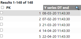
Like modern spreadsheet programs, you can filter displayed data on values shown for each column, thereby reducing the number of records beings displayed:
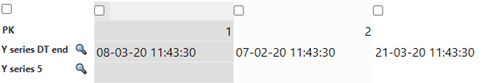
The Orientation layout property of a GridControl did not show any effect, i.e. it would not change the layout of the grid cells. By contrast, in a TabularGridControl, setting the Orientation property to “Horizontal” will make the columns represent the records, instead of the rows:
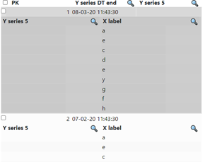
Related data can be embedded by adding another multi-record control within the TabularGridControl. This other multi-record control may be a regular GridControl, another TabularGridControl, or even a ReplicatedColumnsControl if a different representation of the data is needed:
Data filtering
In the same way as for records in a GridControl or GridEditControl, filtering of data values of a column is enabled by setting the "Show Filter" property of a TabularGridControl.
Sorting of columns
In the same way as records in a GridControl, records in a TabularGridControl can be sorted by column by clicking on the column header name.